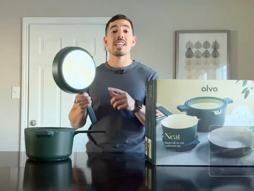
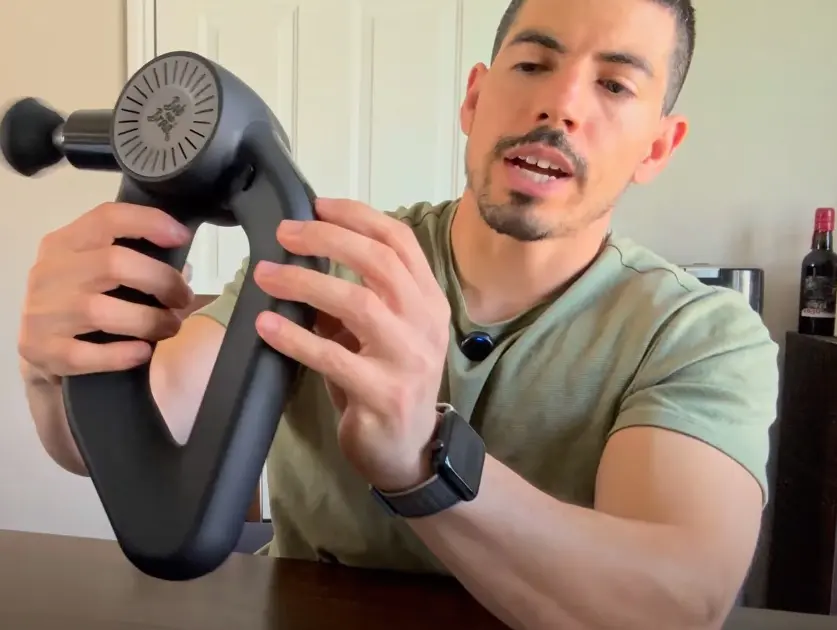
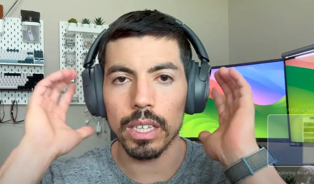
Honest Product Reviews You Can Trust
400+ products tested across tech, home, fitness, and more. Real hands on reviews from an Amazon Platinum Creator, no brand bias, no fluff.


Amazon Influencer
Platinum Creator
400+ Reviews
Across categories
Latest Product Reviews

Amazon Influencer
Verified Creator
400+ Products
Tested & Reviewed
Hi, I'm Daniel
I'm a product reviewer who actually uses what I recommend. From tech gadgets to kitchen tools, I dive deep so you don't have to guess.
No fluff, no fake hype. Just real insights from someone who's tested hundreds of products.
My reviews are 100% honest — I highlight both the good and the bad. No brand pays me to say nice things, and I'm not afraid to tell you when something isn't worth your money.
My goal is simple: help you make smarter buying decisions and avoid expensive mistakes.
Read my full storyWhy People Trust My Reviews
"Finally, someone who actually tests products instead of just reading specs. Your honesty is refreshing!"

"Been following your reviews for months. Haven't made a bad purchase since. Keep up the great work!"

"Saved me $150 on headphones after your comparison video. You're doing great work!"


Find Reviews by Category
Appliances
Major and small appliances for your home
Apps & Games
Software, mobile apps, and gaming products
Arts, Crafts & Sewing
Creative supplies, crafting tools, and sewing equipment
Automotive Parts & Accessories
Car parts, vehicle accessories, and automotive tools
Baby
Baby gear, toys, and products for infants and toddlers
Beauty & Personal Care
Skincare, grooming, beauty tools, and personal care products
Books
Physical and digital books across all genres
CDs & Vinyl
Music CDs, vinyl records, and audio collections


